-
Architects: Barreca & La Varra
- Area: 942 m²
- Year: 2015
-
Photographs:Carola Merello
-
Manufacturers: Castoldi Lighting, Cospe

Text description provided by the architects. Schizopherenic facades, contrasting in a single building located at the center of Milan, Italy.

The Milanese studio Barreca & La Varra decides to improve a buildings facades which was constructed around 1930s with a late 19th century style in the center of Milan, on Via Melloni.


The building consists of 4 floors, plus a basement and an attic. The old look of the building had a brusque façade facing the street and a banal ordinary interior. Overtime, a lift shaft had been added which was not matching with the previous architectural characteristics of the building.


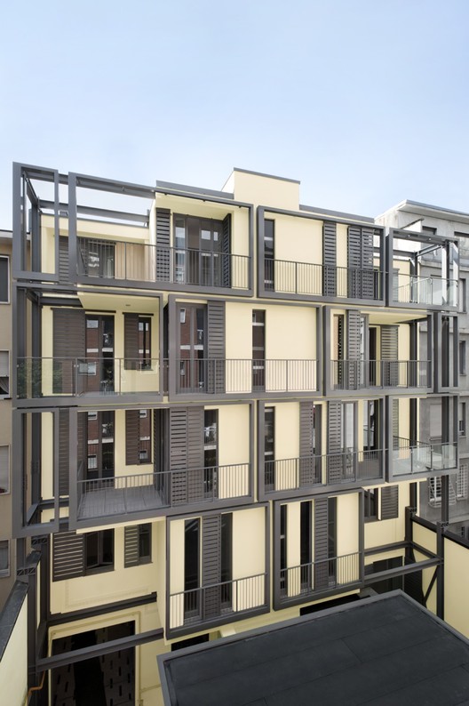
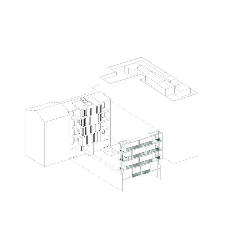
Rather than trying to make the parts look the same, Barreca & La Varra decided to point out their differences with a new design. The ordinary look of the southern façade, facing to the street changed by adding a hidden long terrace that completes the style of the north façade, facing the interior of the building. This look was approached by designing a series of false windows that are cut out from the horizontal sunshade, leaving the attic level set back, there was space created to form a long balcony.

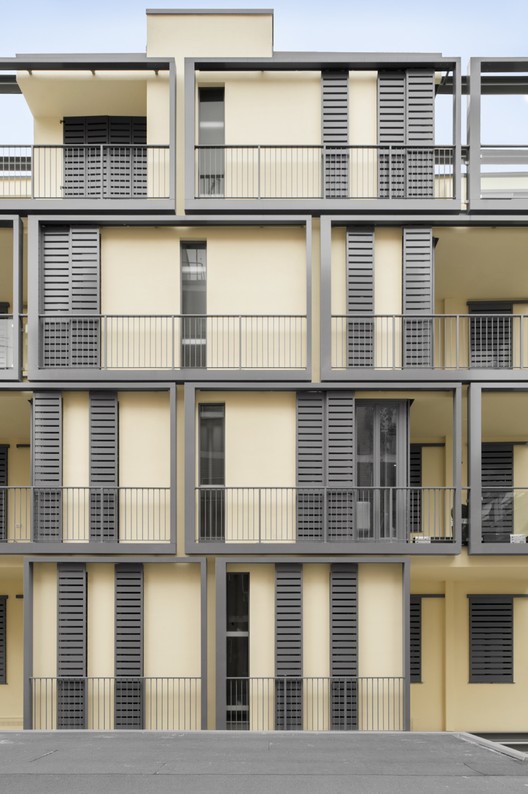
On the other hand, in order to be able to create a larger space for the residents Barreca & La Varra decided to enlarge the north façade, facing the interior of the building two meters towards the courtyard, respecting the distance of other buildings on the block. The façade was framed with interconnecting steel rectangular structures painted in dark grey that divides the façade into grids and points out the visual differences between the spaces with and without balconies. Having a single flow on the façade brought a compact, solid look into the whole design of the building.

This difference between the two facades, called “controlled schizophrenia” by the architects, draws attention to the traditional and the reassuring style of the historical city while dedicating an “open air” room for the residents to complement their space.

Product Description:
- Addition façade was built in order to create extra space for the elevator and the balconies.
- Standard profile was used to create grids. Grids are designed with steel tubes to create frames for each balcony facing the court yard.
- Due to the lack of space, using steal was an easier and faster option to apply. It simplifies the process and reduces the time of the construction.
- Adding a hidden long terrace by designing a series of false windows that are cut out from the horizontal sunshade, leaving the attic level set back


